Lexus Membership Digital Magazine
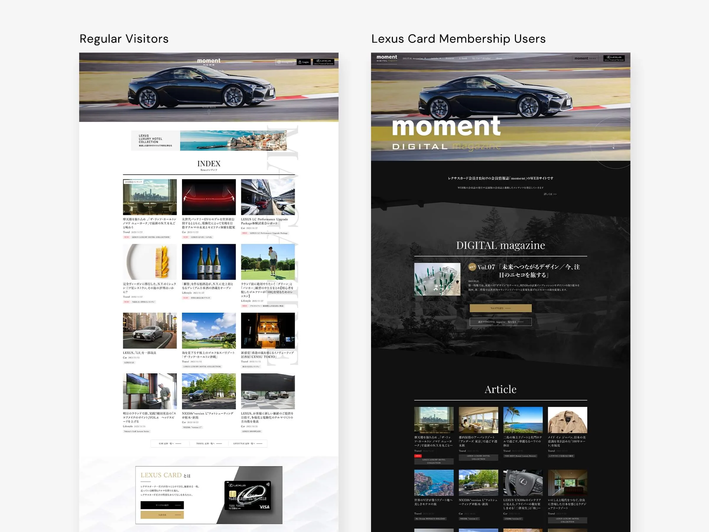
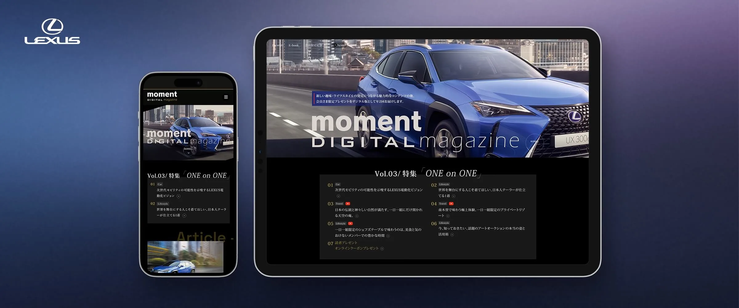
Moment Digital Magazine is a members-only magazine for Lexus Card holders, with lifestyle stories and the latest news for Lexus owners.
Summary
It's a large site with many content and landing pages. This case study covers the early design process and the decisions that shaped it.
Timeline
2021 - 2024
Team
Front-End Engineer, Project Director, Visual/UX Designer (Me)
Tools
Adobe XD, Adobe Photoshop, After Effects, Figjam
Design Principles
User-Centered Design, A/B Testing
My Role
Visual Design, Web Design, Banner Design
Ownership
I led visual design across the project, from first concepts and interface design to campaign assets.
Goal
Lexus is a luxury car brand, and its customers expect a lot. The Lexus Card service gives members exclusive news, campaigns, and benefits. About 85% of them use it on a smartphone.
Our goal was a mobile-first site that reads like a premium magazine and still looks unmistakably Lexus.
- Design mobile-first.
- Make it feel like a site built just for Lexus customers, and make it a pleasure to use.
Process
We used User-Centered Design and A/B testing to guide the design and check key interface decisions.
First we learned about users' backgrounds, habits, and daily routines. Then we turned what we found into design problems, explored concepts, and iterated.
Design Iteration
Analysis and Insights
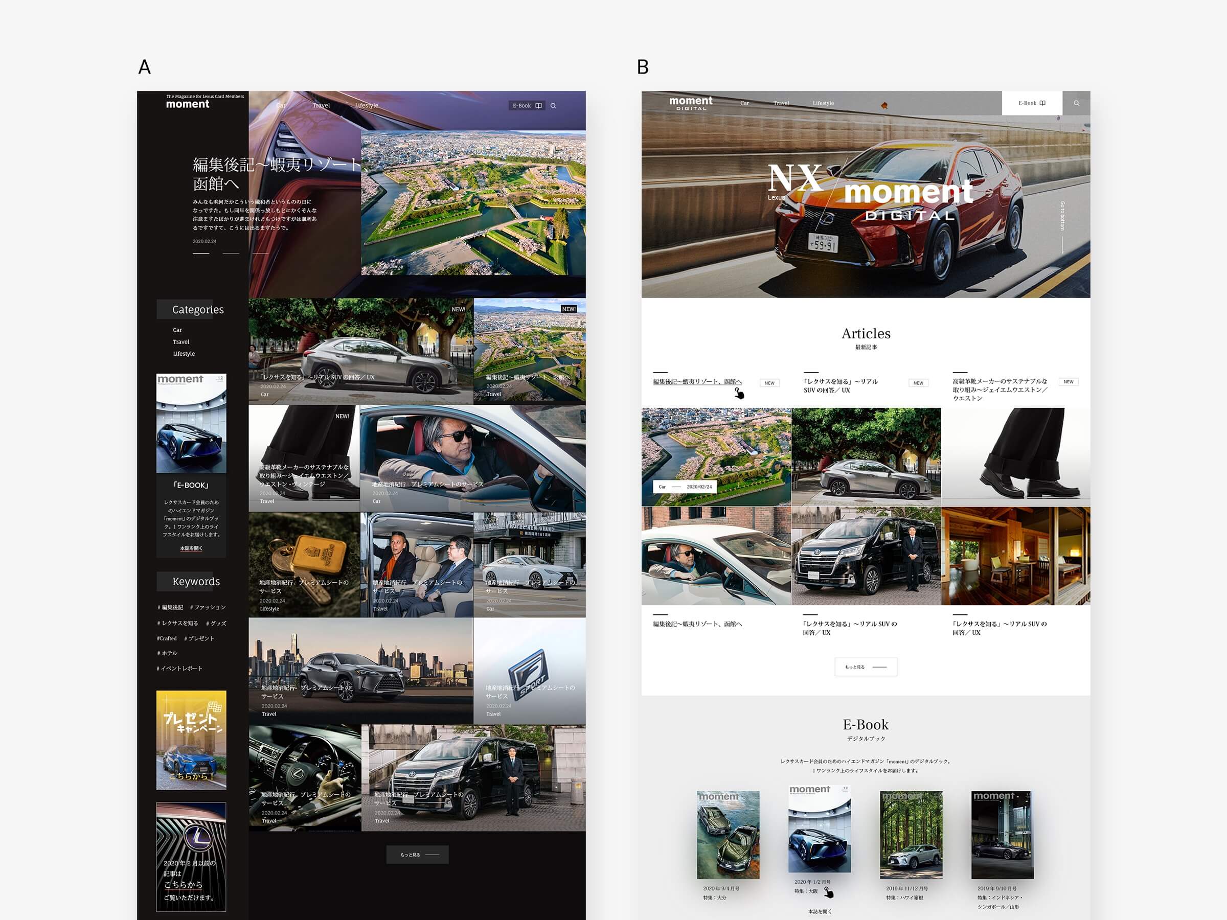
We made two versions of the top page, one black and one white, then compared usability and how easily people reached content to see what needed work.
Design Challenges
🔲 Too Monochromatic
In testing, the interface felt too muted. Key actions were easy to miss.
😵💫 Messy Pattern
We first tried a container-free editorial layout to make it feel like a magazine.
But without structure the page was hard to scan. People weren't sure where to look, and it took more effort to reach the next piece of content.
Design Solutions
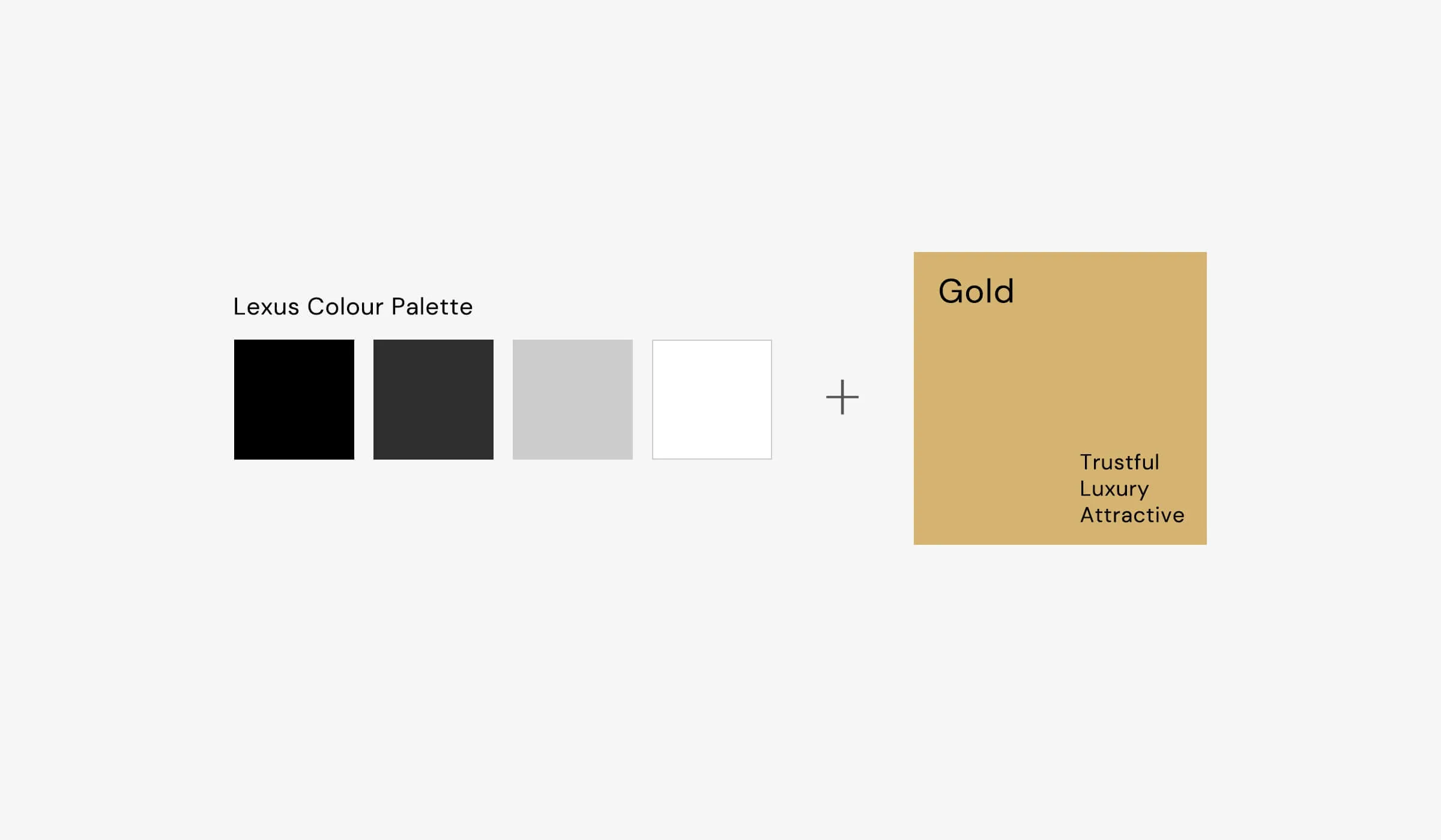
1. Introduced a new accent color
We added gold as an accent color. Used only on interactive elements and highlights, it made key actions stand out and added to the premium feel.
2. Simplified the layout and content hierarchy
We moved to a single-column layout so the page is easier to read and scan. Centered section titles gave the page a steady rhythm and clearer breaks between sections. This change increased scrolling and reading speed by 400%, so users got through a lot of editorial content much faster.
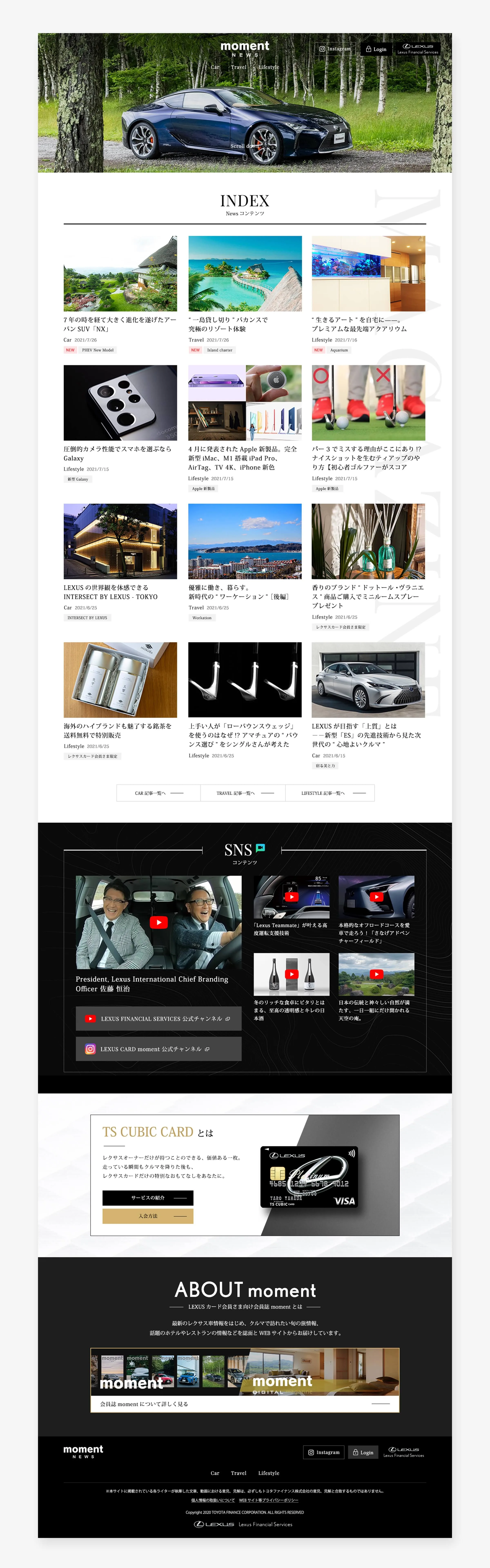
Outcome
The result is one consistent, premium magazine platform. It's now connected to thousands of Lexus websites and uses two design languages: one for logged-in members and one for regular visitors. Members get more personalized stories, plus extras like exclusive gifts.