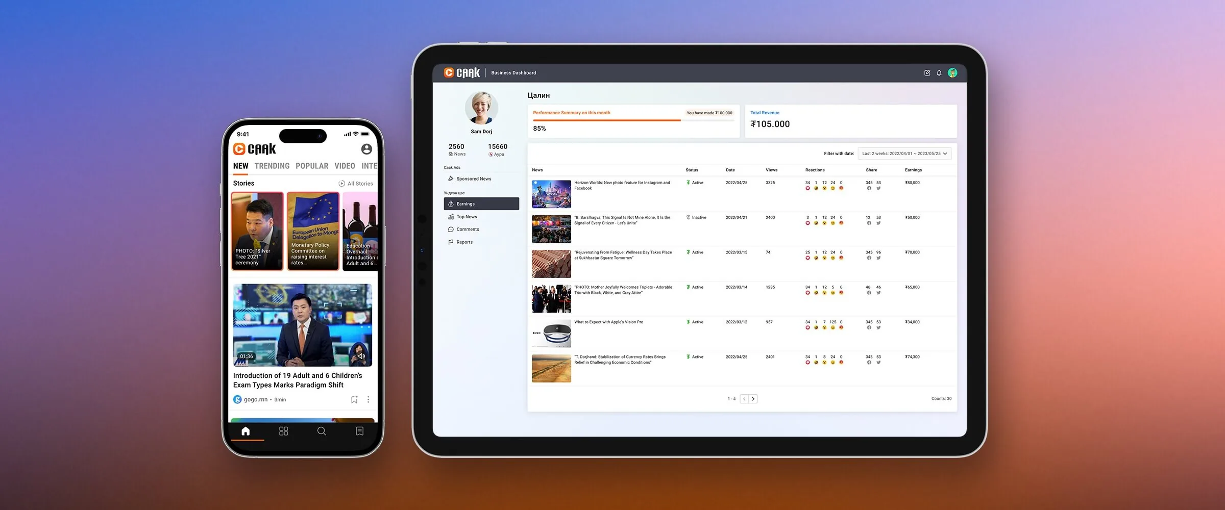
Caak, A Social News Platform
Caak is a social news platform that grew out of one of Mongolia’s major news sites. It shows each reader news based on their interests.
Summary
It runs on iOS, Android, and web. Anyone can publish news on it and earn money based on how their posts perform.
Timeline
May 2022 - August 2023
Team
Application Engineer, Project Director, Product Designer (Me)
Tools
Adobe XD, After Effects, FigJam, ProtoPie, Lottie
Design Principle
Design Thinking
My Role
Product Design, Branding
Ownership
I led the product design system and contributed to user research, interaction design, and brand experience.
Challenge
People in Mongolia spend about 15 minutes a day on news. About 98 news agencies publish across different channels, so finding the stories that matter to you is hard. There's a lot of content, and much of it is negative. It gets tiring.
Caak set out to fix this by showing people news that fits their interests, including more positive stories.
Design Goals
- Create a platform where news can be discovered and discussed from multiple perspectives.
- Maintain a consistent user interface across iOS, Android, and Web.
- Create a content monetization model based on content performance.
- Deliver personalized news based on users’ interests and behaviors.
Research & Discovery
Research Approach
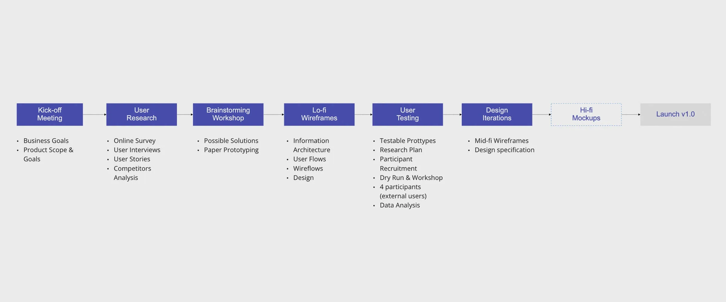
I used Design Thinking for this project: short loops of learning what users need, finding pain points, and improving the product.
Understanding Users
I conducted remote research using Maze to identify user pain points, content-consumption behaviors, and opinions about the news experience.
Research Findings
84% of participants at the event wanted to find the latest and most relevant news each morning.
1. Weekly News
Busy people like a quick weekly roundup to catch up.
2. News Quality
Images and headlines strongly influence which articles people choose to read, and sponsored content can attract attention through the same entry points.
3. Interest-Based Discovery
People struggle to discover news related to their hobbies and interests across multiple sources.
Personas
Based on the research findings, I created personas to explore user needs, motivations, and pain points in more depth.

P.Tuhai 28
Profile
She lives in the countryside and checks the news every day. Keeping up with so many sources is hard, so she bookmarks articles to read later.
Needs
・Read news from multiple agencies in a single source.
・Save useful content for later reference and inspiration.
・Discover more content based on her interests.
Pain Points
・Switching between multiple sources to find relevant news.
・Relying on browser bookmarks and extensions to save useful content.
・Limited ways to discover interest-based news.

E. Beltechu 42
Profile
He enjoys commenting on news and engaging in discussions with others. He checks comments regularly and skims articles, but worries that some news may be inaccurate.
Needs
・Find reliable news.
・Engage more deeply with content through discussion.
Pain Points
・Difficulty distinguishing reliable news from sponsored content.
・Few places for real discussion on existing news platforms.
Product Solution
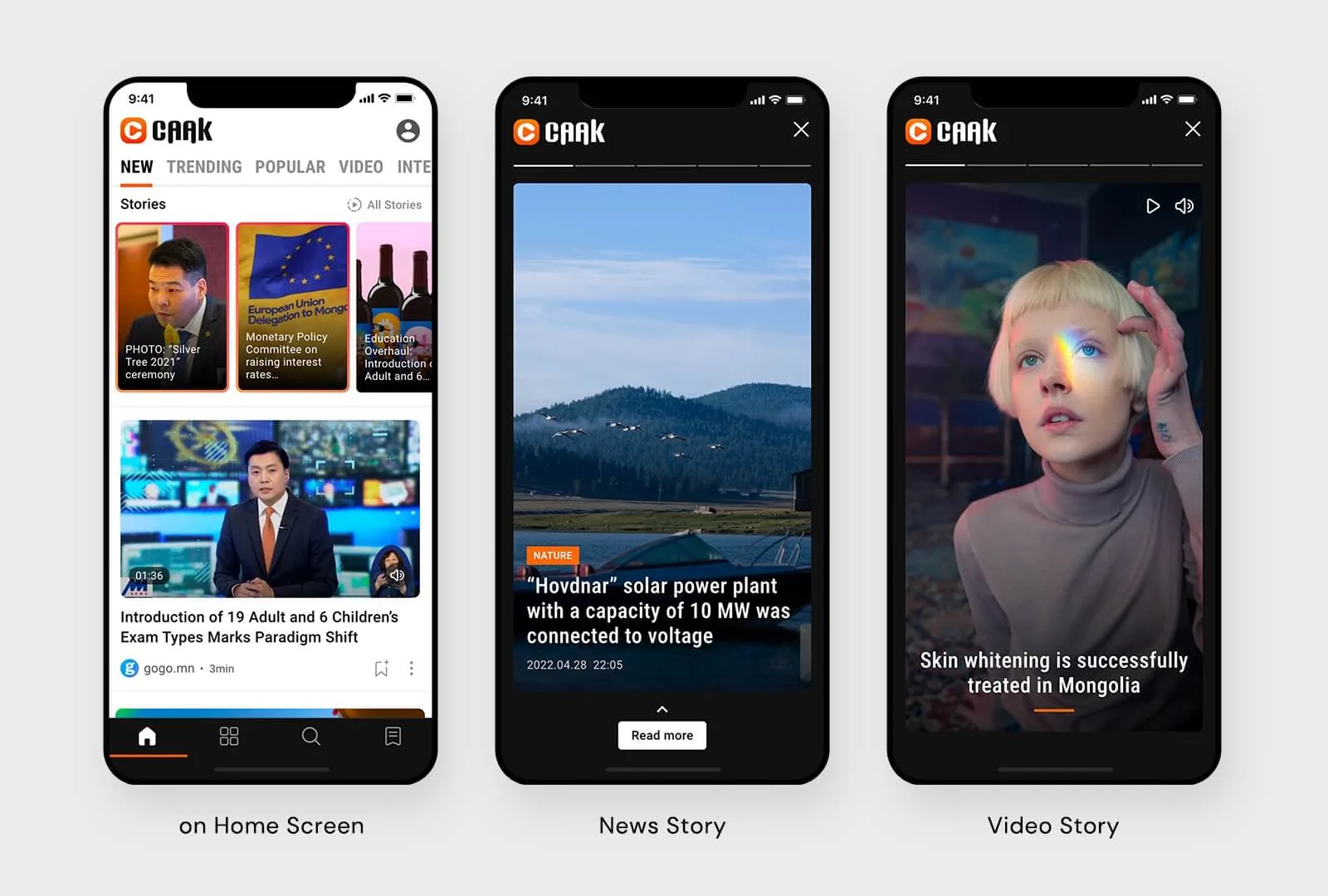
1. News Stories
A short news format for daily and weekly updates, so important stories are quick to scan.
Why it works: short, and easy to come back to.
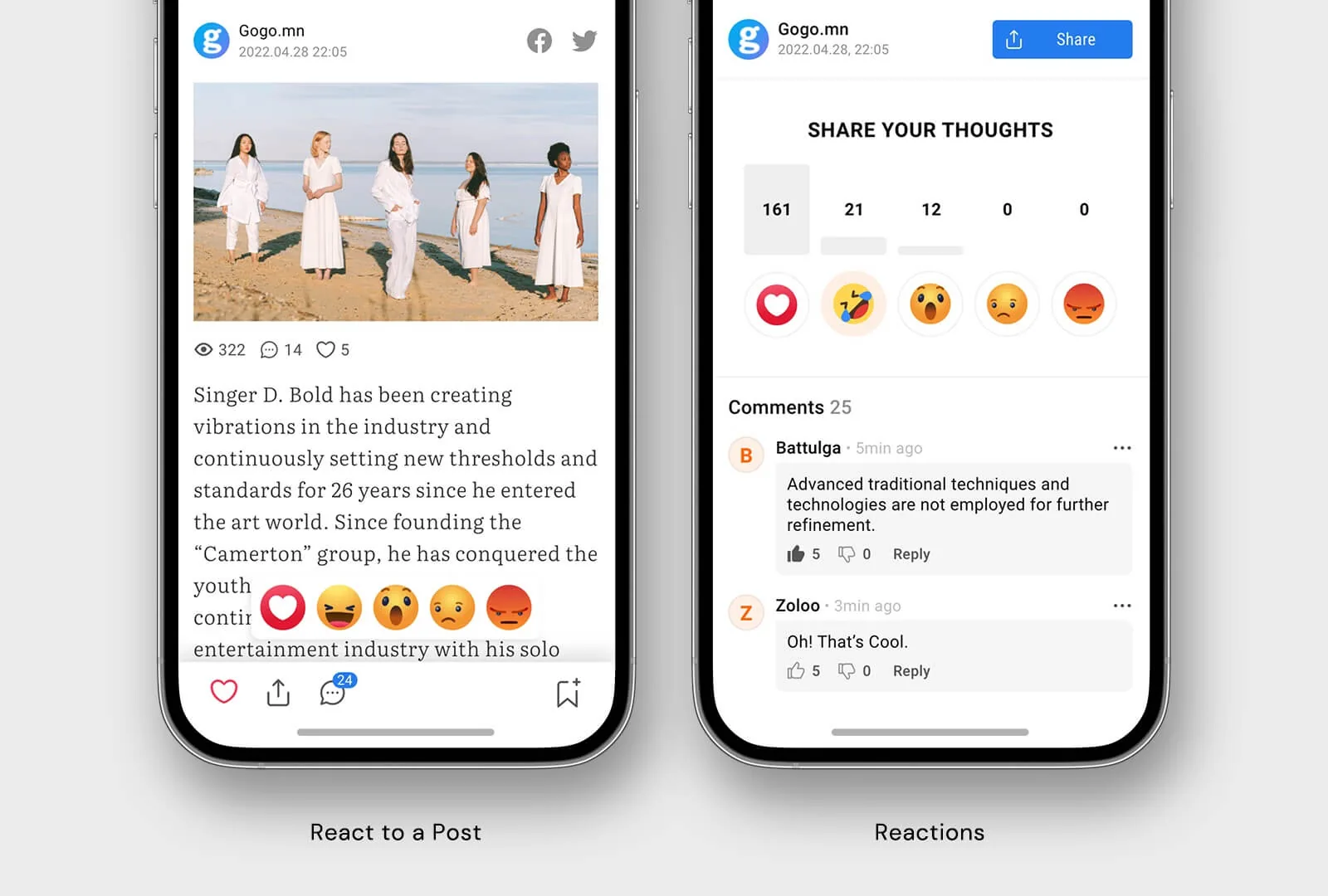
2. Emoji Reactions Instead of Comments
An emoji lets someone react to a story without writing a full comment. It also shows at a glance how readers feel, which gets more people to join in.
User Validation
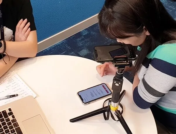
User Interview and Usability Testing
We were short on time, so I built mid-fidelity prototypes and tested them with 6 outside users who read news regularly. The sessions looked for usability problems and at how people read and save content.
Key Findings from the Participants
- On the home screen, users wanted to see more news within a limited amount of space.
- The all-stories page felt too dense, and users did not want to browse outdated content from previous months.
- Users preferred saving articles for later rather than reacting to them immediately.
- Users preferred reading related messages and reactions instead of browsing long comment threads.
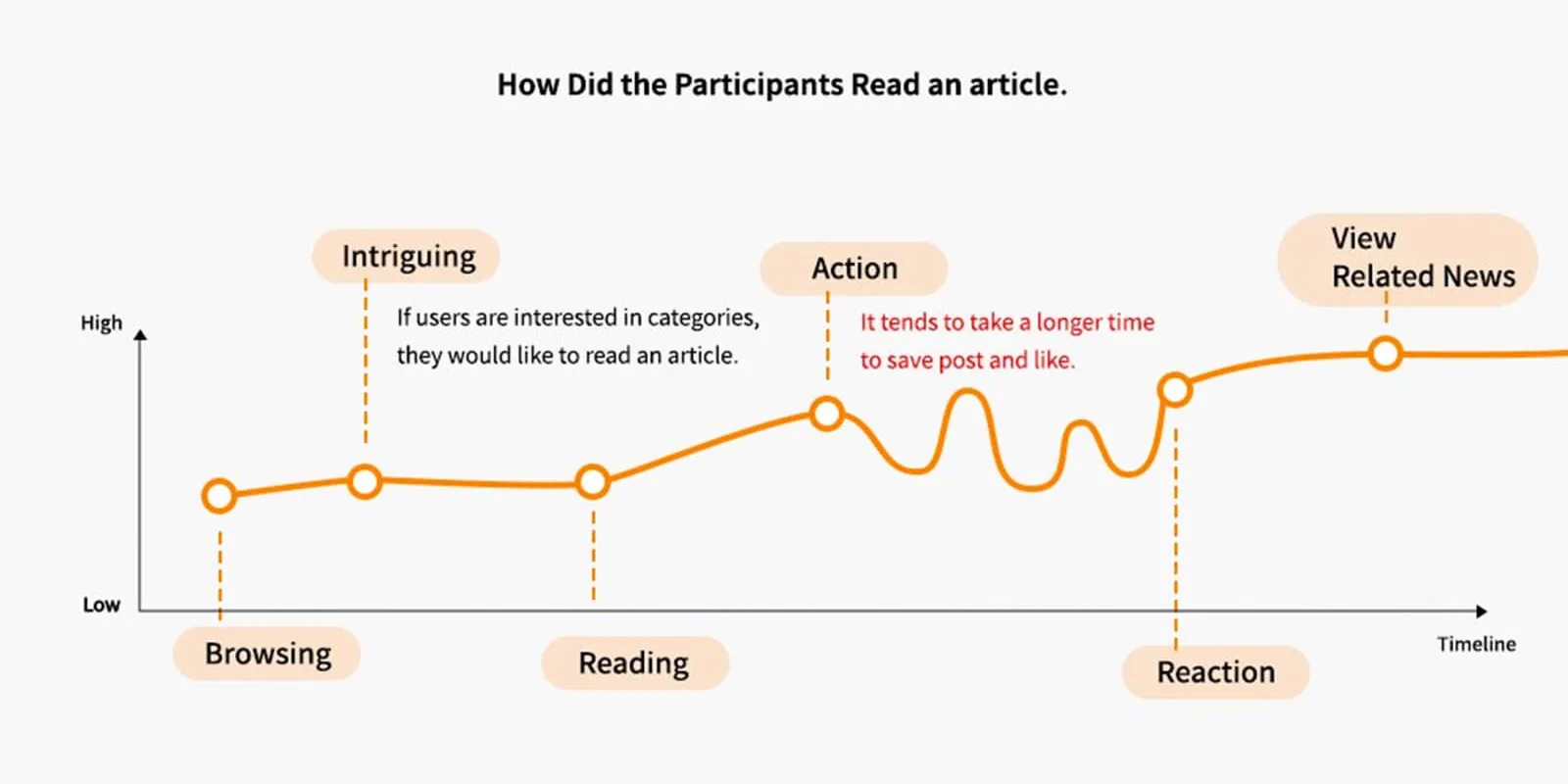
Design Iteration Based on Research Findings
After testing with real users, I reworked the interface and information hierarchy based on what I saw them do.
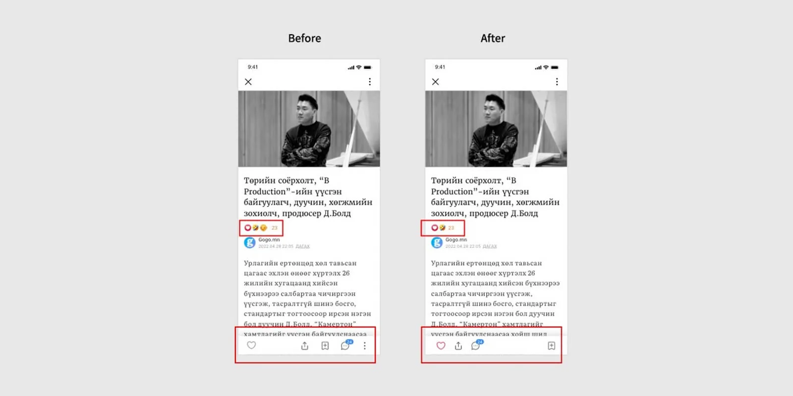
Iteration: Post Detail
- Too many emoji options diluted the meaning of the reactions. Limiting the interface to the two most-clicked emojis made sentiment easier to scan.
- The save button was hard to find. I moved it and made it more visible.
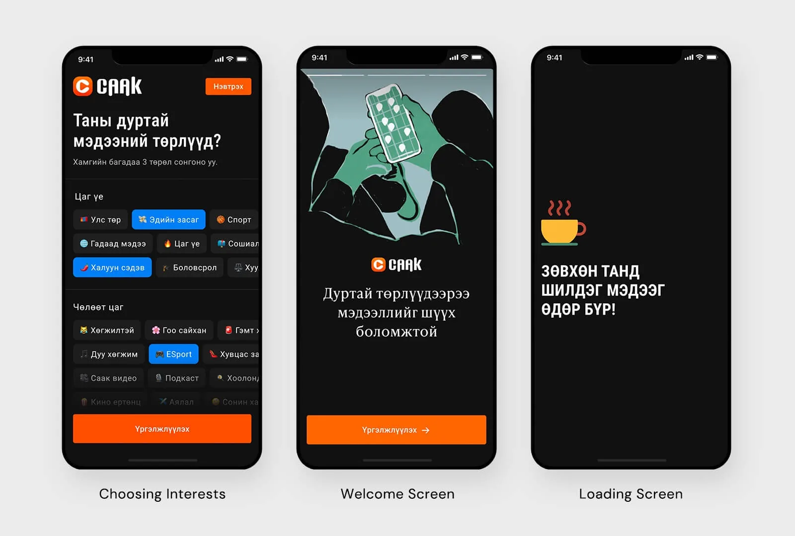
App & Dashboard Design
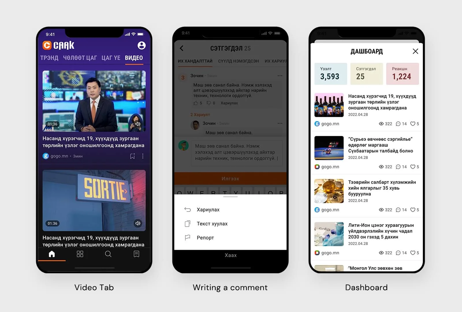
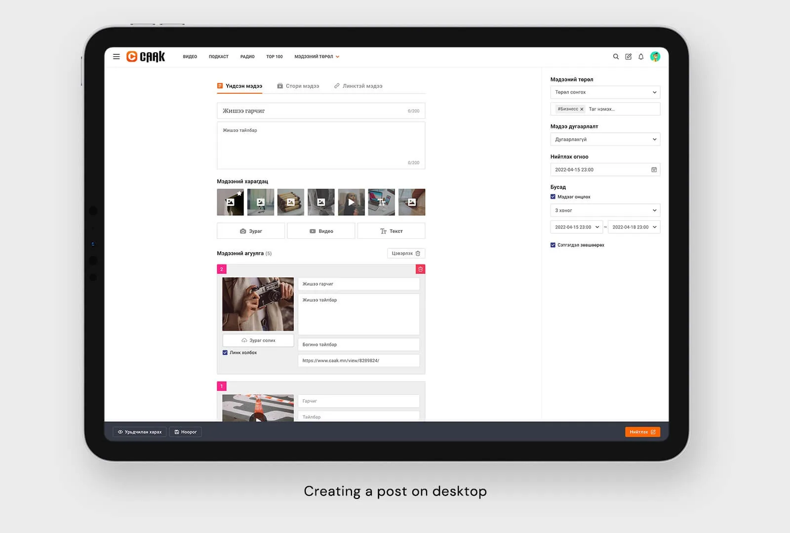
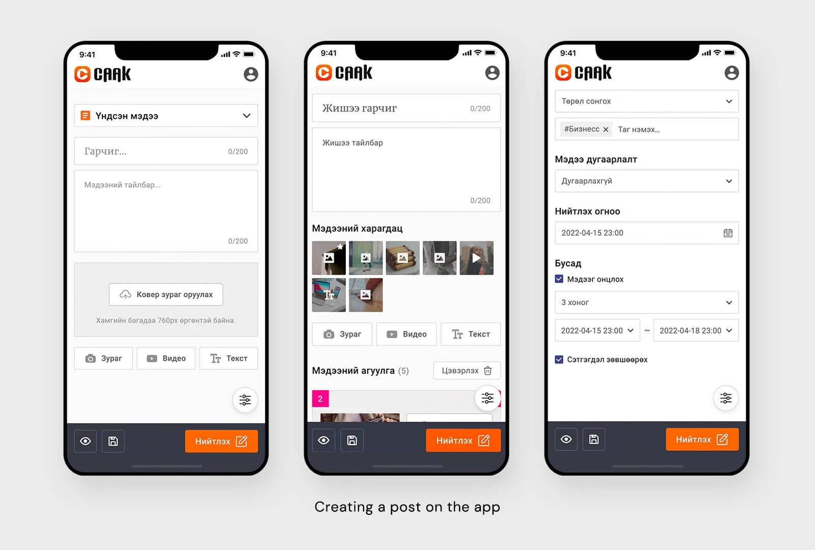
I also designed the creator dashboard, where publishers write articles and track how they perform and earn.
Impact
After the redesign, engagement went up across the platform. Emoji reactions alone raised user engagement by 200%. News Stories became a bigger part of how people read, pulling attention toward curated stories. We kept collecting feedback through Hotjar, and 98% of votes were positive.